
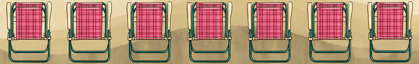
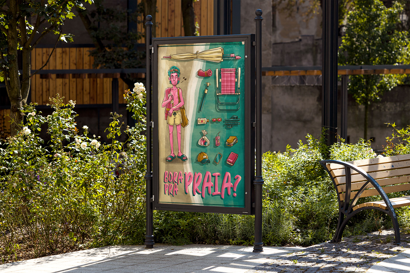
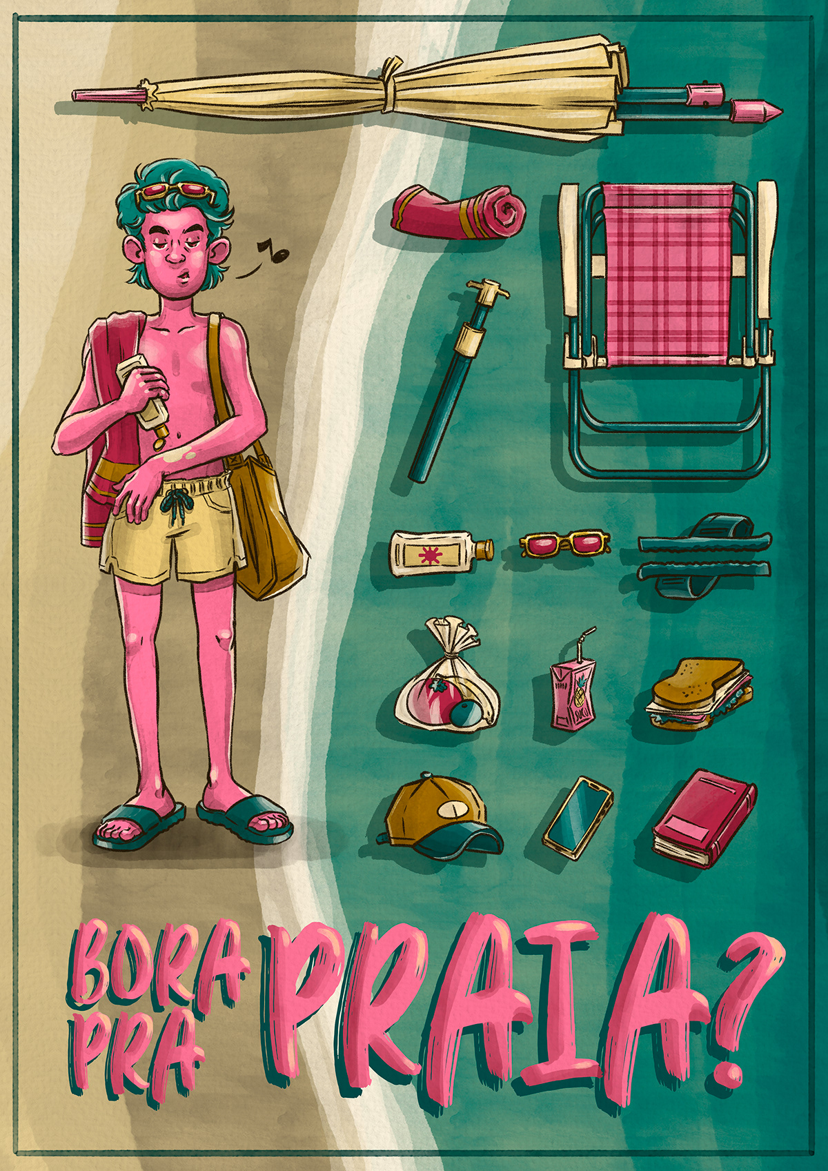
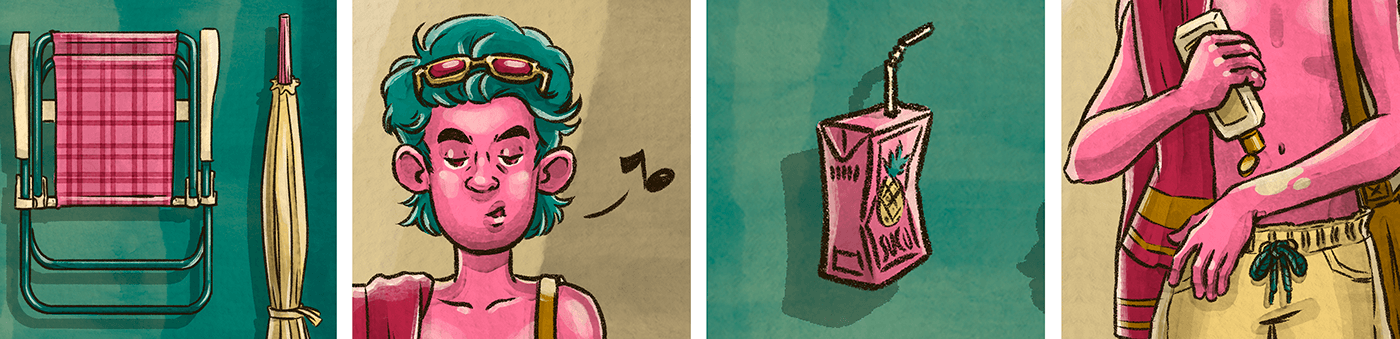
PT Este trabalho foi feito pensando em um dia de praia e o que seria preciso levar para aproveitar um belo dia de sol. Os objetos foram dispostos como se fossem itens de um jogo a serem escolhidos. O garoto está se preparando para sair de casa, com sua bolsa, toalha e, é claro, passando bastante protetor solar.
Para a paleta de cores foram utilizados três tons principais, o turquesa e o amarelo remetem às cores do mar e da areia, já o rosa confere um contraste e um caráter lúdico à ilustração. A arte poderia ser utilizada como poster, convite ou divulgação de um evento.
EN This work was made thinking about a day at the beach and what you would need to take to enjoy a beautiful day in the sun. The objects were arranged as if they were items in a game to be chosen. The boy is getting ready to leave the house, with his bag, towel and, of course, applying plenty of sunscreen.
Three main tones were used for the color palette, turquoise and yellow refer to the colors of the sea and sand, while pink adds contrast and a playful character to the illustration. The art could be used as a poster, invitation or promotion for an event.
ustration.


CONTACT
adrieloliveira.ilustra@gmail.com

